ADA Accessible Charts Overhaul
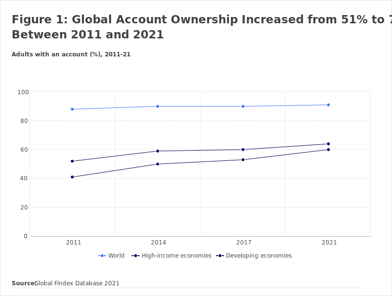
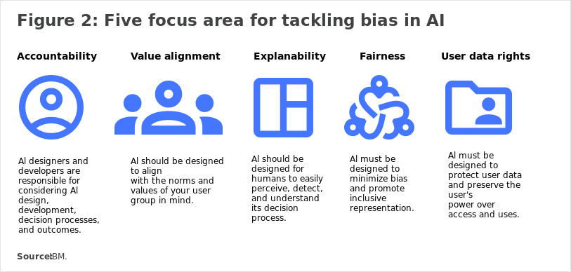
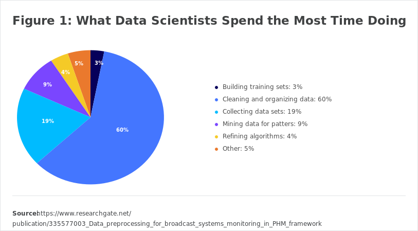
As part of a web redesign project for the CFA Institute, I took the lead in creating over 100 ADA-compliant charts using Figma, addressing the unique challenges of ensuring accessibility for visually impaired users. This involved organizing content within Figma to be read by screen readers, a process that had not been done before in our organization.

Situation:
In a web redesign project aimed at enhancing user experience, it became clear that making our charts ADA-compliant was crucial for inclusivity. The team faced challenges in ensuring that visually impaired users could access and understand the data presented in our charts.
Task:
As the designer responsible for creating the charts in Figma, my task was to develop visually appealing and informative graphics while ensuring they met ADA accessibility standards. This included organizing content to be effectively read by screen readers.
Action:
To tackle the challenges of implementing alt text and ensuring screen reader compatibility, I researched best practices for accessibility in chart design. I developed a systematic approach to ordering content within Figma, allowing screen readers to interpret the information accurately and in a logical sequence. This process was new to our organization, so I collaborated closely with team members to refine our methods and ensure consistency.
Resolution:
The ADA-compliant charts were successfully integrated into the redesigned website, significantly improving accessibility for visually impaired users. Our innovative approach to using Figma for chart design not only enhanced the user experience but also set a new standard for future projects within the organization. The positive feedback from users and stakeholders highlighted the importance of our commitment to inclusivity and accessibility.


